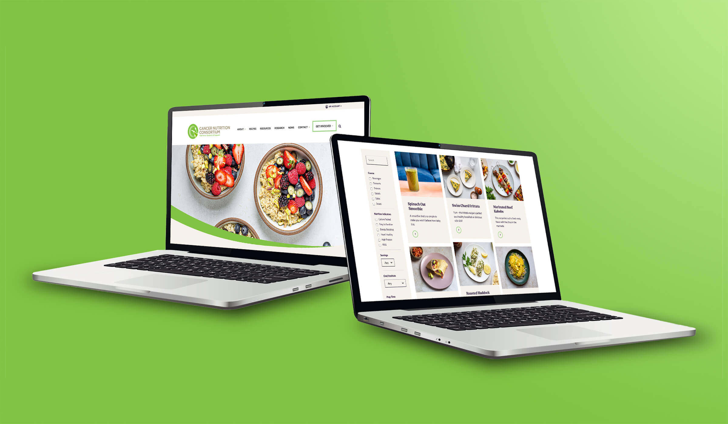
The New & Improved CNC Website
We partnered with our frequent collaborators at Adjacent to modernize the Cancer Nutrition Consortium website.

Reimagining The Brand
The primary goal of this brand refresh was to update the look and feel of the CNC’s brand elements and supporting graphics / assets. Given the bifurcated nature of the consortium’s primary audience (doctors and healthcare professionals along with those going through cancer treatment and recovery) a new strategy that was as professional as it was approachable / friendly was required. To that end more curves and other organic shapes were introduced into the website’s design along with a new illustration strategy, updated color scheme, new photography style, and more.

A New and Improved Experience
In addition to reorganizing the site’s structure to be more useful for users, and creating an online shop / members area, the recipes section was overhauled to make it both easier to use and much more appealing to look at.
By rethinking the site’s structure, our team was able to create a smoother, data-driven, experience for users, one that was more intuitive for new users and familiar to existing ones.
By creating a shop and eCommerce section of the site donations can now be handled completely by the consortium. The CNC cookbook, published in 2023, can be sold directly on the consortium’s website, and memberships can now also be handled 100% on the platform by the organization.

Perhaps the most dramatic change to the site overall was the updates made to the recipes section, the most frequently visited section of the site. In addition to restructuring the way filtering and search was handled over 100 photos of the recipes were taken to better showoff the quality of the expertly crafted, cancer-conscious foods and beverages.
